
What are design settings?
The design settings are it design system that was developed to allow more branding as well as custom design. There is a possibility to edit all icons like the videos controls (play, pause icon). Additionally, 2-D elements can be styled. Furthermore, there is the possibility to customize the properties of text hotspots, quiz hotspots as well as the hotspot label.
How can I access the design settings?
The first thing to mention is that the design settings are currently only available within the WebVR version and are only displayed if there is paid access to WebVR.
The design settings can be accessed via the Settings, which can be found in the top-right corner.
This requires two steps:
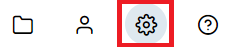
1. First, the general settings of the project have to be opened. These can be found at the top right and are represented symbolically by a cogwheel.
2. Click on this icon to open the settings. Within these settings, you have to navigate to the subitem “Design Settings”.
All settings can now be found here.
In the two following images, this is also shown again pictorially.

How can I create and use a theme?
By default, a theme is always created which is named “Default”. This cannot be deleted.
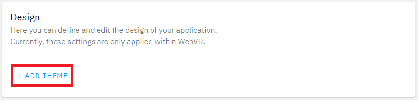
However, it is also possible to add further themes. For this purpose, the “+ADD THEME” button can be used.
This can be seen in the next image.
A theme can be selected for each hotspot. If the theme is selected for the hotspot, the design will be changed automatically when the colors etc. are changed.
This can be seen in the next image.

Setting options
Icons
| Name | Description |
|---|---|
| Home | Control-Elements home button |
| Forward | Control-Elements forward button |
| Backward | Control-Elements backward button |
| Video play | Control-Elements video play button & Video-Controls under the Video-Hotspot |
| Video pause | Control-Elements video pause button & Video-Controls under the Video-Hotspot |
| Video fast-forward | Video-Controls under the Video-Hotspot to skip forward |
| Video fast backward | Video-Controls under the Video-Hotspot to skip backward |
| Close | Hotspot-Close button |
| Help | Help image inside the menu |
Generic
The generic settings are used for 2-D-Content inside WebVR.
| Name | Description |
|---|---|
| Primary color | Primary color is used for button outlines etc. |
| Secondary color | Secondary color is used for button outlines etc. |
| Background color | Background color is used for the background of content |
| Background color contrast | Background color contrast is used for the background of content that needs a conrast |
| Text color | Text color |
| Text color invert | Inverted text color that is used for full primary color buttons |
| Slider default color | Default background color of the slider |
| Radius | Defines if the elements should be rounded or not |
| Button icon style | Icon style for buttons |
| Content icon style | Icon style for buttons and content |
| Language | Language that should be used |
Theme
Themes can be used for Text-Hotspots und Quiz-Hotspots
Label
| Name | Description |
|---|---|
| Label text color | Text color of the label |
| Font | Font of the label |
| Name | Description |
|---|---|
| Title text color | Text color of the title inside a Text-Hotspot |
| Content text color | Text color of the content inside a Text-Hotspot |
| Textbox background color | Background color of the text box |
| Font title | Font of the title inside a Text-Hotspot |
| Font content | Font of the content inside a Text-Hotspot |
| Horizontal title alignment | Alignment of the title inside a Text-Hotspot |
| Horizontal content alignment | Alignment of the content inside a Text-Hotspot |
| Textbox border radius | Radius of the text box. A value greater than 0 will result in rounded edges |
| Name | Description |
|---|---|
| Question text color | Text color of the question inside a Quiz-Hotspot |
| Answer text color | Text color of the answers inside a Quiz-Hotspot |
| Question background color | Background color of the question text box inside a Quiz-Hotspot |
| Answer background color | Background color of the answers text box inside a Quiz-Hotspot |
| Answer active background color | Background color of the answers text box inside a Quiz-Hotspot, when end user waiting for the answer solution |
| Answer right background color | Background color of the answers text box inside a Quiz-Hotspot, when the end user selected the correct answer |
| Answer wrong background color | Background color of the answers text box inside a Quiz-Hotspot, when the end user selected the wrong answer |
| Font question | Font of the question inside a Quiz-Hotspot |
| Font answer | Font of the answer inside a Quiz-Hotspot |
| Horizontal question alignment | Alignment of the question text inside a Quiz-Hotspot question text box |
| Horizontal answer alignment | Alignment of the answer text inside a Quiz-Hotspot answer text box |
| Question border radius | Radius of the question text box. A value greater than 0 will result in rounded edges |
| Answer border radius | Radius of the answer text box. A value greater than 0 will result in rounded edges |
Feedback
Post your comment on this topic.